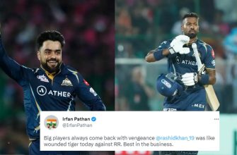
- A Closer Look at the Rajasthan Royals: The Significance of Team Crest and Logo
- Genesis of the Teamcrest and Logo
- An Eye-Catchy Emblem
- The Intricacies Behind Its Design
- The Royal Blue: Colour Significance
- Lion’s Roar: Symbolizing Fearlessness
- Royalty Personified
- The Evolution Over Time
- The Takeaway: More than Just a Logo
- A Logo With Deep Relevance
A Closer Look at the Rajasthan Royals: The Significance of Team Crest and Logo
If there is one symbol that represents the passion, excitement, and allure of the Indian Premier League (IPL) in cricket, it would undoubtedly be its team logos. Making their grand debut on television screens and online platforms worldwide, these logos serve not only as striking visual icons but also resonate deeply with millions of passionate fans.
Among them, one stands out for both its artistic elegance and historical significance – the logo of the Rajasthan Royals. Let’s delve into what makes this emblem so special to understand more about its origins, design elements, and symbolic importance.
Genesis of the Teamcrest and Logo
The inception of the Rajasthan Royals’ crest dates back to 2008 when they were formed as an inaugural franchise of IPL. The purpose behind creating a distinct logo went beyond just providing unique identification.
Primarily designed by British agency venturethree, it served as a medium to forge a direct connection between the team and its supporters while encapsulating the spirit and values it stood for. Consequently, a lot was riding on getting it just right.
An Eye-Catchy Emblem
The final product is indeed visually compelling. In essence, the logo features a majestic lion roaring ferociously against a vibrant blue background encased within an ornate royal frame. It consists of two main elements: first being the lion—the ‘simha’ or ‘singh’, barsaat representing bravery—and second being the crown atop denoting royalty. The metaphorical representation instantly speaks volumes about what Rajasthan Royals aim for—courageous performance filled with dignity.
The Intricacies Behind Its Design
The Royals’ emblem does much more than tell a tale of bravery and nobility—it acknowledges its roots in Rajasthan’s rich heritage and culture. Here are the design elements that contribute to creating this memorable logo.
The Royal Blue: Colour Significance
The dominant colour, royal blue, was no random selection. Instead, it holds profound religious importance in Hindu mythology as blue is considered divine—being linked closely with Lord Krishna who is often portrayed in this hue. Besides spiritual connotations, it adds a contemporary spin to the otherwise regal emblem, subtly hinting at the fusion of modernity and tradition that defines the team ethos.
Lion’s Roar: Symbolizing Fearlessness
At the heart of the crest sits a fierce lion baring its teeth—an imposing depiction apt for symbolising courage and strength battle-hardened athletes need to triumph over opponents. Again, drawing from cultural references resonating across India, ‘lion’ features prominently in Rajputana heraldry—demonstrating their fierce spirit, courage at arms length, and perceived superiority among warrior classes.
Royalty Personified
Crowning the shield on top is an ornate accessory perfectly fitting for an ensemble called Royals—an illustration suggestive of royalty as encapsulated by age-old tales peppered around heroism resounding through majestic forts dotting Rajasthan landscapes. Such imagery isn’t just exclusive window dressing but purposeful signalling meant to personify their quest—to rule IPL domain via cricket conquests.
The Evolution Over Time
Naturally, like all brands, even logos undergo evolution reflecting subtle shifts within team strategies or responding to changing times—and there have been few changes during course years since Royals’ formation.
- In 2016, they redesigned insignia featuring two lions facing each other, underlining team solidarity and unity.
- In 2018, Royals once again reverted to their original crest design following a two-year banishment. This time lion’s roar was louder—implying renewed grit determination and willpower trounce adversaries on pitches.
Thus, in recurring theme cycles continues shifting subtly within Royals’ identity while steadfastly adhering its historical ethos reflecting an ongoing evolution simultaneously upholding tradition.
The Takeaway: More than Just a Logo
Beyond mere aesthetics, the Rajasthan Royals logo operates at various levels—it’s a page from history books representing strong evocative symbolism functioning as collective rallying point ingraining sense belonging among followers alike.
Fundamentally though; it serves operative word emphasising ‘Royals’. After all, no better story tells this tale aptly—valour courage displayed field religious devotion injected fervent chants resounding throughout Sawai Mansingh Stadium audiences.
Drawing from such rich symbolic narratives sets apart Royals emblem much more than solely attractive monogram—it’s embodiment bold ambition combined inherent nobility laying framework defining one India’s most celebrated cricket franchises!
A Logo With Deep Relevance
The potent messaging embedded within Rajasthan Royals logo beautifully encapsulates spirit of Rajasthani culture—an intertwining panache striking perfect balance between preserving heritage adding modern futuristic touch via representation fierce energetic sport like cricket marking them out unique brand IPL ecosystem.
Rewind some years back standing today we can infer ensemble true manifestation ideals values resonating heartfelt stories courage fortitude pays homage glorious past while striving carving brighter future every match they play – Welcome world Royal battlefront amplified singham’s roar!